THE BRIEF
Bond, a SaaS product for payment solutions, asked us for an explainer video. As a hero video, it would need its flashy, eye-catching moments, while also showcasing a bit of the real user experience of using the app.

The solution
We agreed on a 90 second video. The first and last part would be the strongest in terms of animation, while saving the most explanatory part for the middle. The agency took care of the copy of the script and the voiceover. The art was also created separately, by the agency's designer.
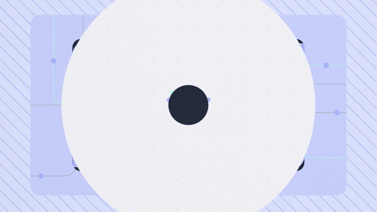
The main idea for the motion was to be super silky and smooth. We also wanted it to feel volumetric. A short depth of field would give the sensation of depth, and some 3D cameras and objects were used.
THE FOLLOW-UP
Some time later, the same client wanted to try with a different brand approach. This time they were called Atelio, and the same elements had to be reused, but with a different design skin. That of course also includes a different approach on designing the motion style.
After that point, we developed a storyboard following the established art direction. This was later imported to After Effects, where the proper animation started.
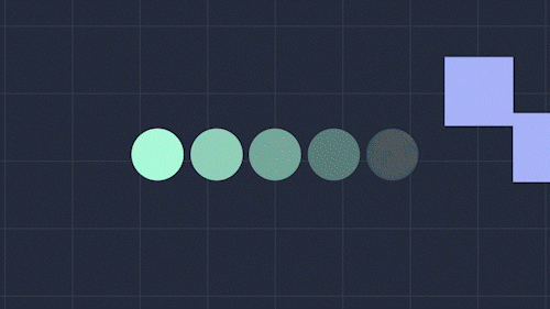
My approach for the animation this time was to make it more energetic and upbeat. Snappy transitions, mask reveals and "tunnel moments" keep this video fun and interesting.
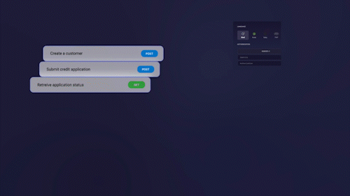
On the explainer sections, where we need the actual UI to take protagonism, some snappy transitions and subtle loops keep the piece having some visual interest on a second level.
It's also important to keep the scrolling text smooth, instead of just using the choppy movement the video recording probably has. For this, I use the material from the video recording but I do a little motion magic behind the curtain.